Background
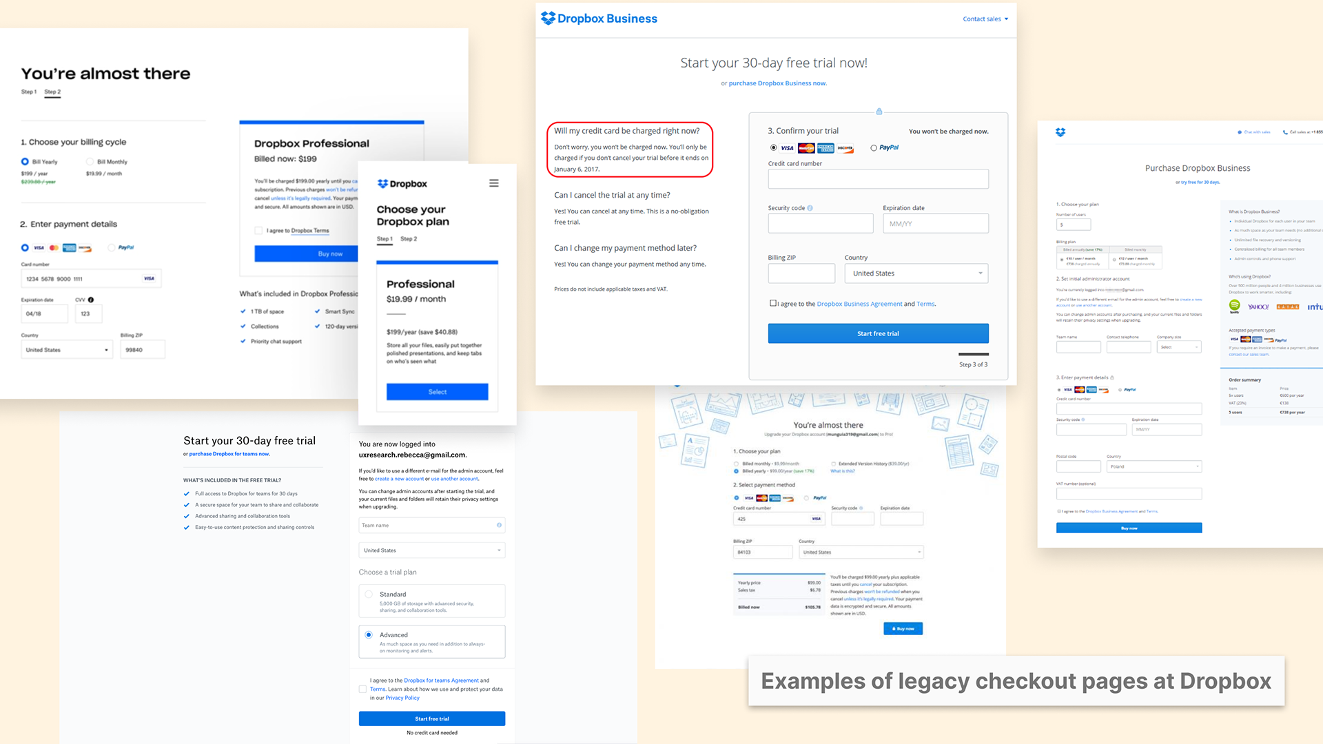
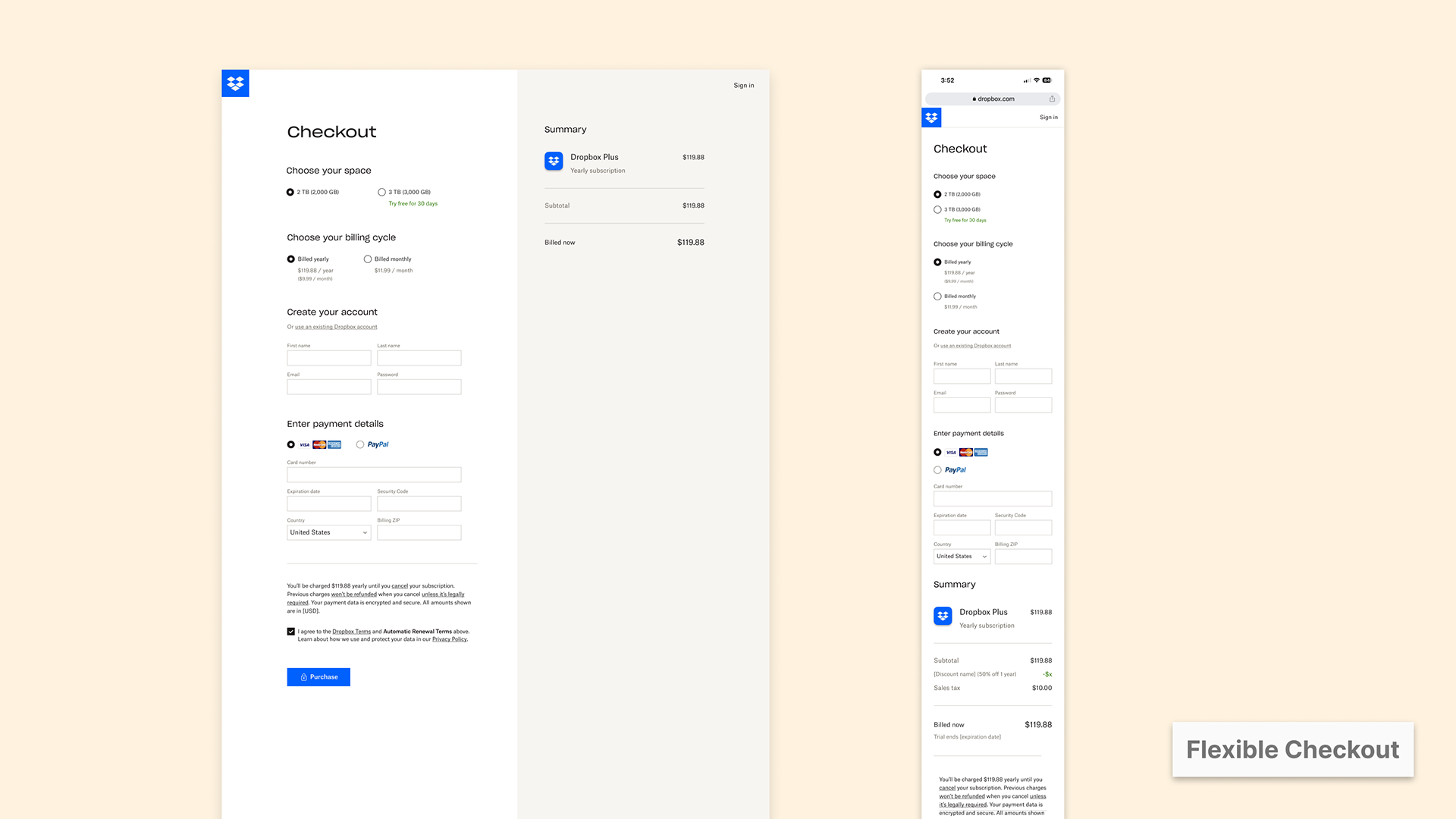
As Dropbox grew, we started to see several versions of the checkout pages exist on Dropbox's surface that didn't have consistent style or content. The inconsistency introduced design challenges but also created maintainability problems for the engineers. In 2021, the team had a new checkout design to unify all the SKUs with modular components - Flexible checkout.
Problem area
The new design has simplified the checkout; however, after I joined the team and conducted a UX audit on the current flow, I proposed to the team that renewing the checkout mobile should be a priority.
The main problem from the audit was that the mobile checkout is an adaptation of the web without adjustments to make it mobile-friendly.
- The page scrolling is long
- The font size and spacing need to be adjusted
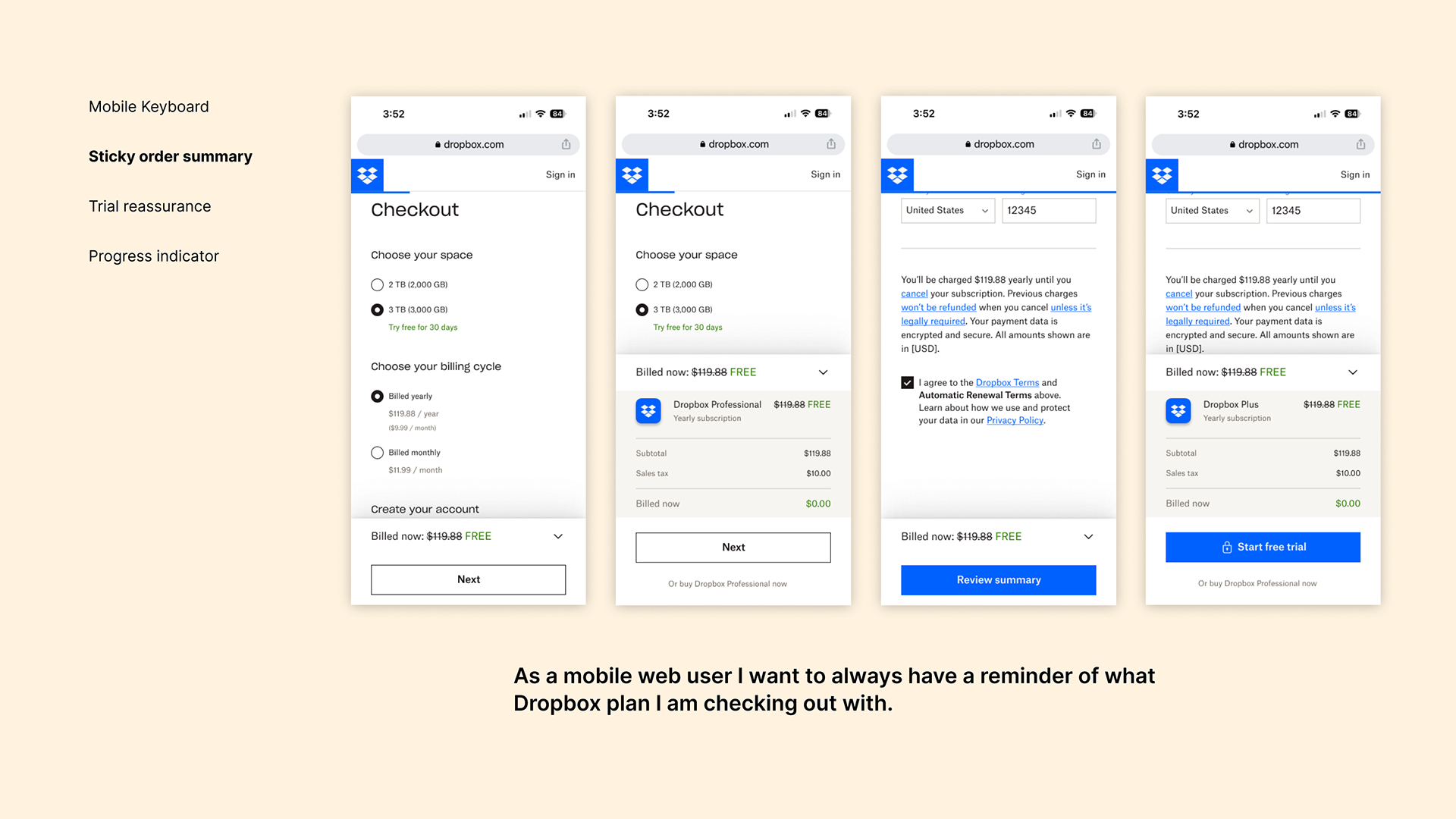
- The discoverability of the summary section, which contains the plans and pricing information, is low. Users aren't able to find out the plans that they chose on checkout mobile until reaching the bottom of the page.
My role
As the design lead on checkout, my role was to design a new checkout mobile that is mobile-friendly and can serve as an experiment for future iterations.
Investment
To help the team understand the magnitude of the problem and whether mobile is an area that the team should invest in 2023, I worked with Data to analyze the mobile traffic.
Two key data that informed our decision:
1. Around 25% of personal traffic and 12% of our business traffic comes through the mobile web -> Mobile represents a significant amount of traffic.
2. The conversion rate on the desktop web experience is 2-3X higher than on the mobile web -> There might be an opportunity to boost the conversion rate on the mobile.
With the help of my PM and Data partner, the opportunity sizing estimated that a 5% statistically significant lift would result in $1.4M in annualized recurring revenue after 7 weeks. The potential revenue plus the run time gives the team additional insight into the reasons for prioritizing this experiment.
Goals & KPIs
All projects we work on, including this project, at Checkout this year should ladder up to the revenue goal at Dropbox. The main KPIs for the projects are:
- Checkout conversion rate - How many users complete the check form and hit the CTA?
- GNARR (Gross net annual recurring revenue)
The opportunity sizing 5% stat sig lift represents ~9% of our team’s revenue goal.
Hypothesis
From the competitor research and the UX audit, we hypothesized that by optimizing and enhancing the mobile web checkout, the improvement of the user experience will lead to an increase in the checkout conversion rate and GNARR (Gross net annual recurring revenue).
Ideation session
To kick things off, I organized an ideation session to get ideas from the team on how we might improve the mobile checkout experience.
I structured my ideation session as follows:
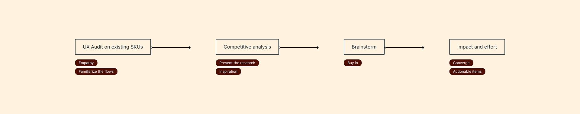
By involving cross-functional partners and stakeholders in the ideation process, we not only gain early buy-in on ideas but also get a clear signal of which ideas might be low-hanging fruit. Ones that need more evidence.
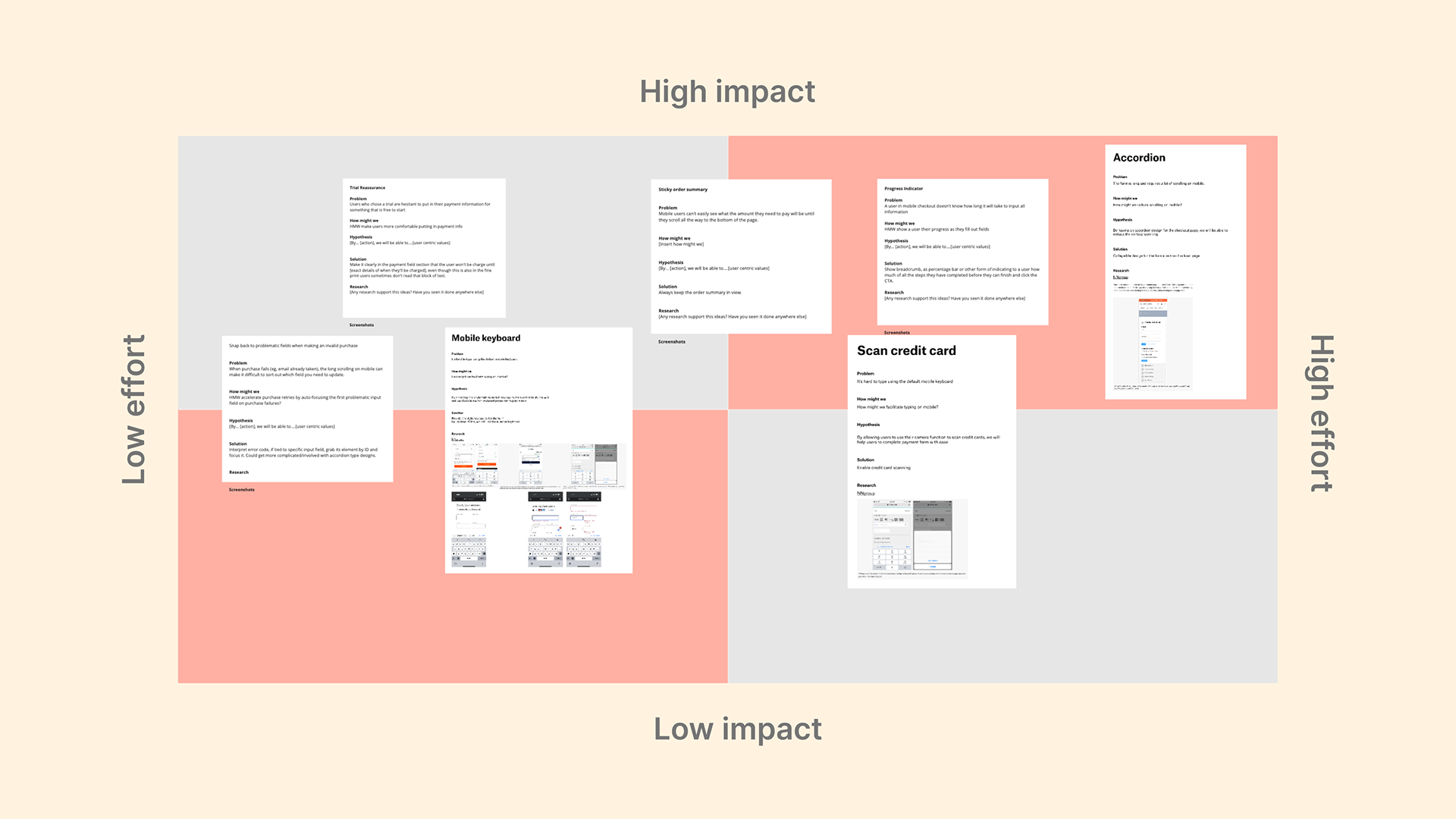
The ideas in the low-effort and high-impact quadrants are the ones we would want to launch and learn from the experiment results. The high-effort, high-impact ideas are the ones we plan to research further before launching in future iterations.
Feature Highlights
The ideas that came out of the ideation session are:
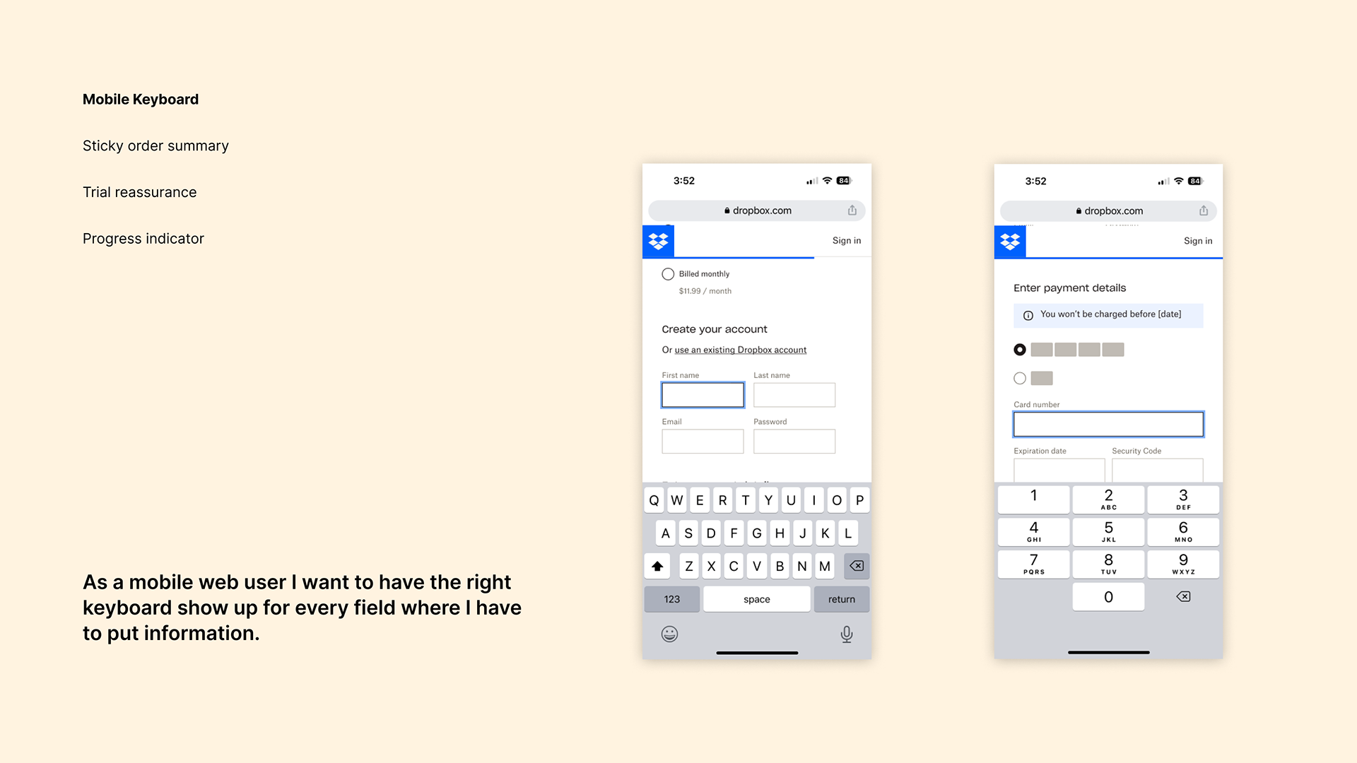
- Mobile keyboard
- Sticky order summary
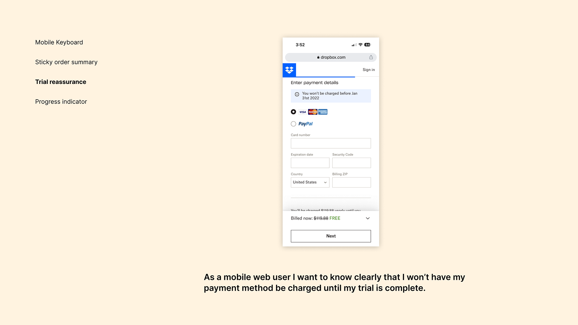
- Trial reassurance
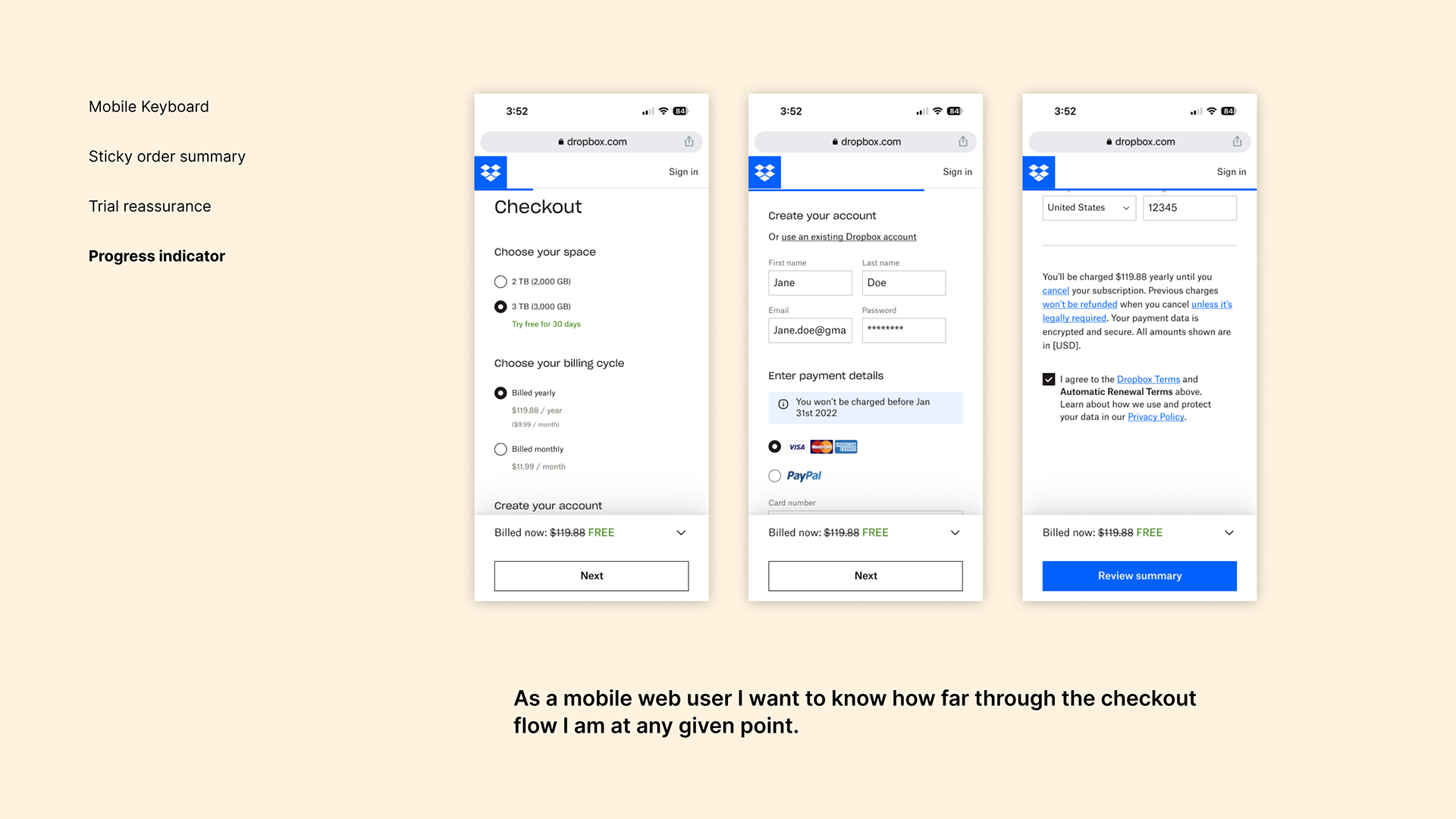
- Progress indicator
Post launch
Conversion metrics:
We observed 2.3% increase in checkout conversion rate, which translates to a 650K increase in GRARR.
Engagement metrics:
We saw 72% of users open the chevron to view summary details. This indicates that the summary is important to users before making the final purchase.